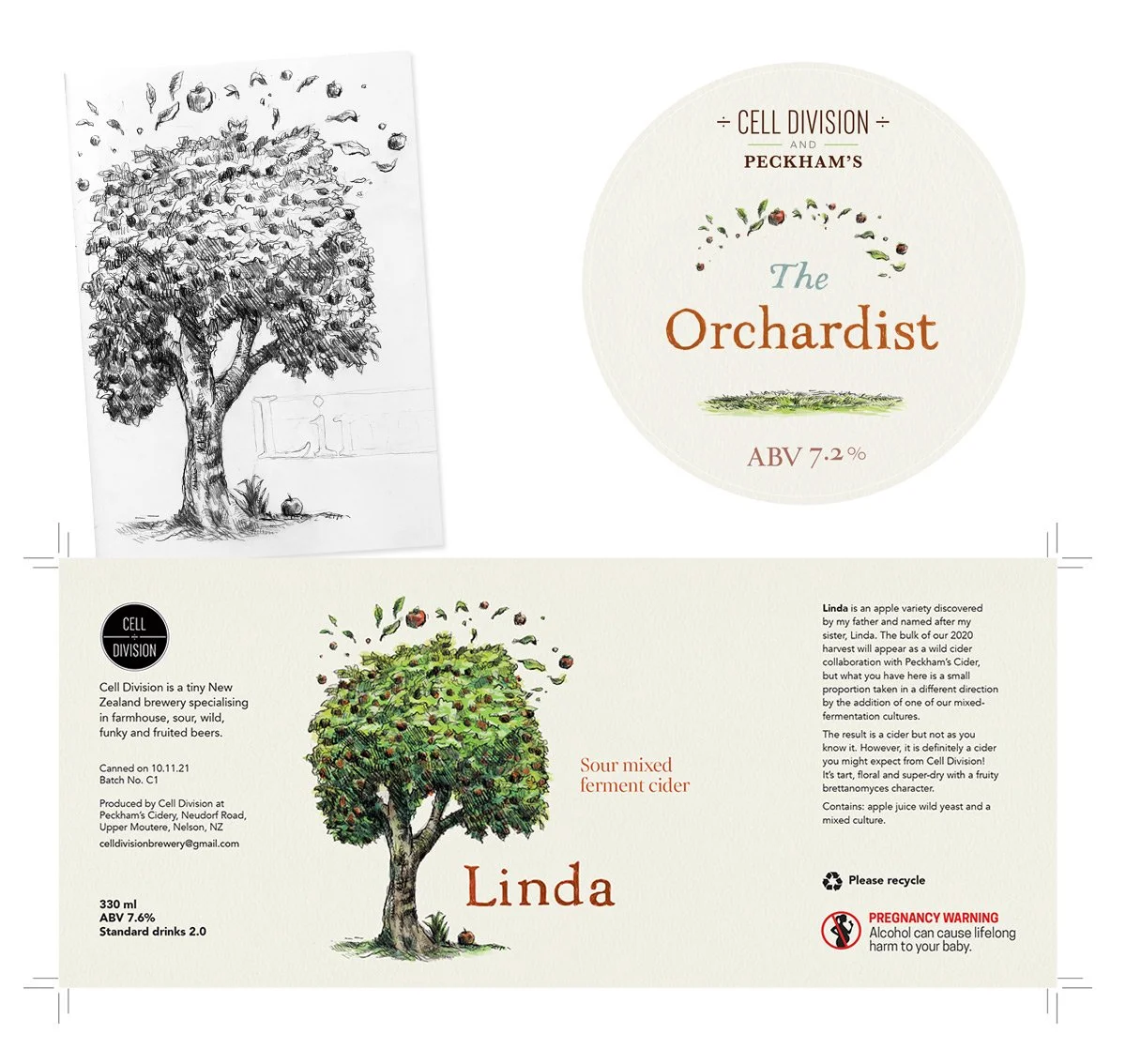
Design for cans and tap badges for Jamie’s new classy cider Linda, and its offshoot The Orchardist for which he collaborated with Peckham’s. It was fun trying to create the feel of Winnie-the-Pooh books.
Vision 20|20
In late 2020 I got to help with this great project named Vision 20|20. It’s about vision testing resources and learning for school students.
The dynamic team was made up of occupational therapists, an optometrist, product designers, and a whole big mob of teachers and intermediate school kids. The Vision 20|20 team asked me on board to help design some testing resources, and a logo, and to create some short animations.
Update: the project is a finalist won silver in the Best Design Awards, in the category Value of Design. Woop! Thanks to Machiko, Mary, Kelechi and Sarah and the rest of the team.


New beer label for Cell Division
Here’s a new beer label for Jamie' McQuillan’s boss beers. This one is a thing he’s been working on up in Tasman with Peckham’s Cider, and it’s named Fire Graff. It’s coming out soon, in a can.
Jamie wanted something that felt Surrealist, like a Magritte painting, and we settled on the idea of a painting of the two main ingredients on fire. I’m not a good painter, but I made the idea suited a nice flattish naive style, and was good fun to paint. Thanks to Liz who did the sweet letters.

Bye, Musikband
I had to share just one more of these. Die Musikband unfortunately had to dis-band, and recently enjoyed the happy-sad feeling of playing a great final gig (thanks, friends and Crown people!). Here’s the poster I made. The band were all stoked with the idea of something that felt Soviet poster-ish, and this sort of coincided with Yuri Gagarin’s pioneer journey into space 60 years ago. Our bass player Karen is a massive fan, she urged me to include Vostok 1. In the foreground is the Cadbury’s building, viewed from our practice rooms, bandaged like a small-town Christo work, soon to be demolished for the new hospital. Lots of change.

Acoustic wall mural for local office
The local office of engineering firm GHD asked me to design something about the local landscape, that could also improve the acoustic performance of their cool office space (in the Bing Harris Building). Autex Cube is a really versatile rigid material: we could print on it, and water-cut any shapes we wanted, which allowed us to create a relief image to have more presence and hopefully more improved sound in the room.
This illustration is a loose kind of fish-eye view of Otago harbour, with stylised shapes that might remind people of Robin White or Colin McCahon. Part of the drawing process (pencils, then vectors) involved fitting the shapes as efficiently as possible into the large panels of uncut material, in a kind of reverse jigsaw puzzle, to reduce cost and waste.


